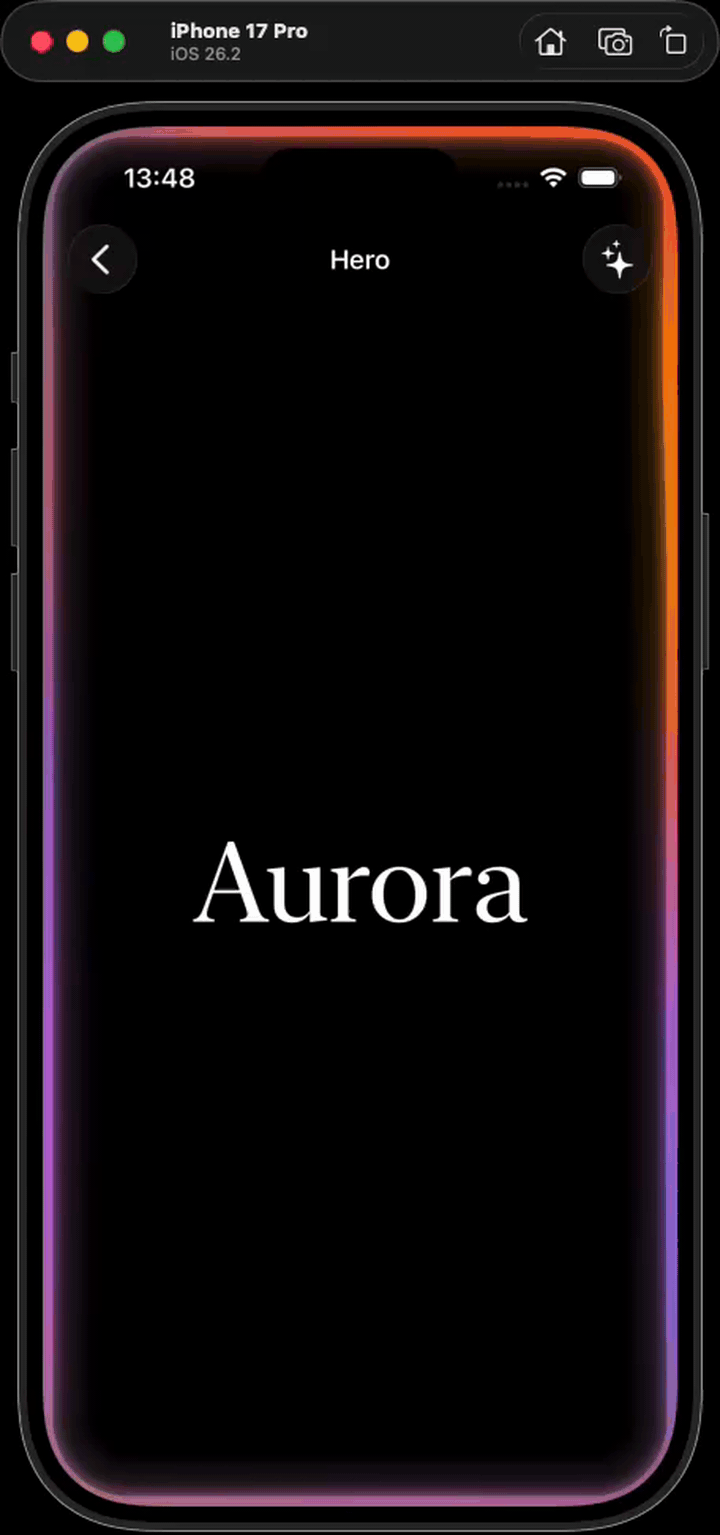
Aurora
Most accurate, simple and customisable Apple Intelligence–style glow for SwiftUI. Backed by Metal shaders.
→.package(url: "https://github.com/tornikegomareli/Aurora.git", from: "0.4.0")
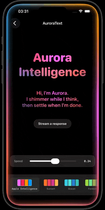
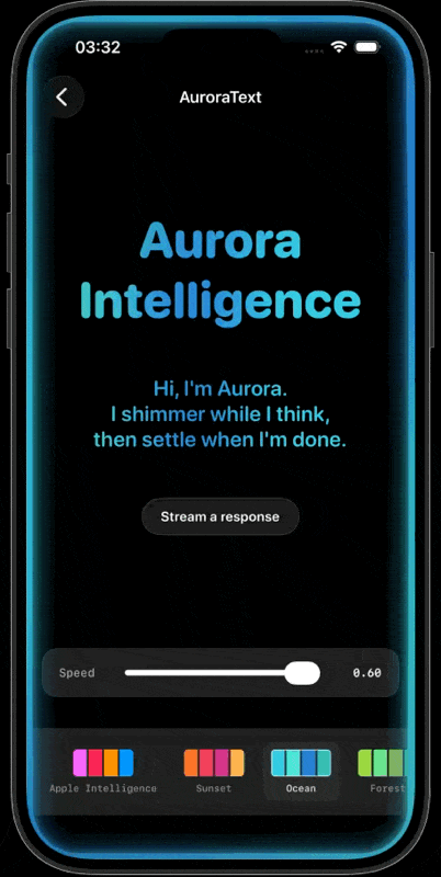
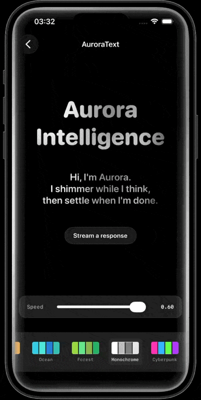
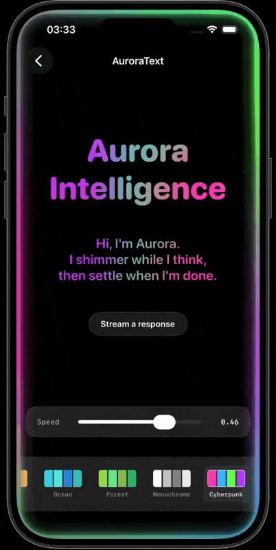
AuroraText
Same animated metaball field as the glow, used as a fill for SwiftUI Text glyphs — the iconic Apple-Intelligence shimmering text look. Drop-in for Text, palette- and mood-aware.
What’s in the box
Native Metal
One fragment shader. No images, no GIFs. Renders at full GPU speed inside any SwiftUI view.
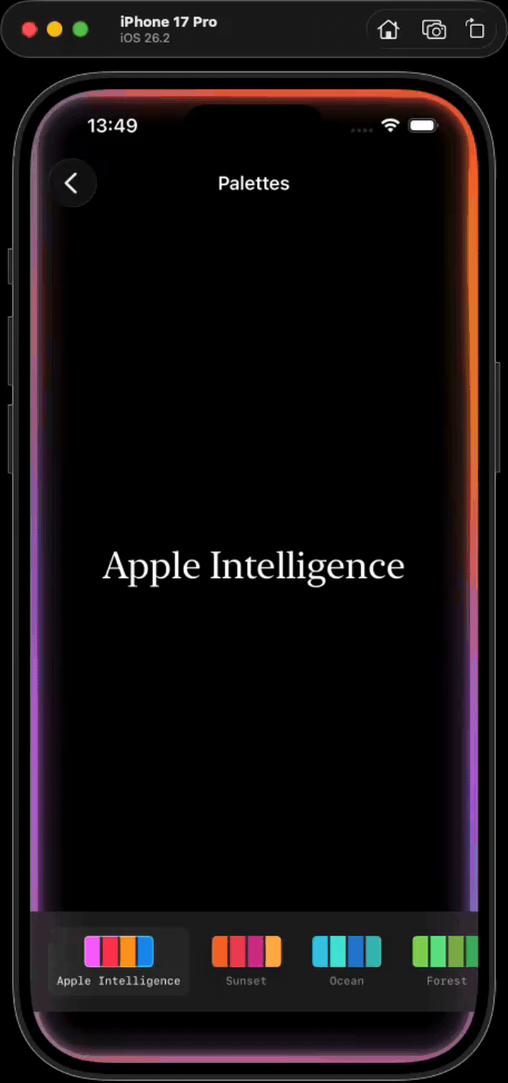
Six palettes
Apple Intelligence, Sunset, Ocean, Forest, Monochrome, Cyberpunk — or roll your own from raw RGB.
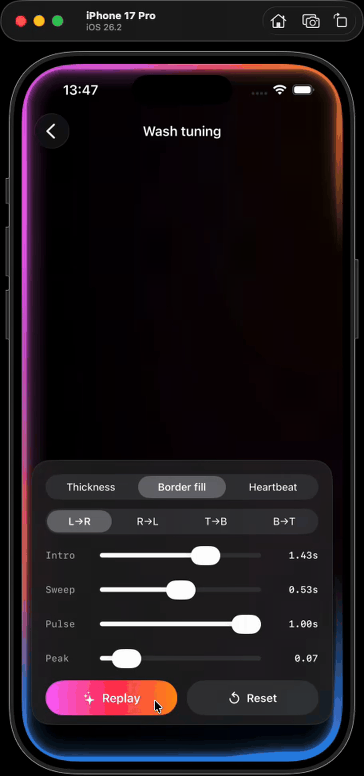
Three intro styles
thicknessGrow, borderFill, heartbeat — pick how the glow appears, dial the speed.
Four directions
leftToRight, rightToLeft, topToBottom, bottomToTop — drives wash and border-fill from any side.
Mood presets
listening, thinking, error, success — bundles palette and pace for state-aware UI in one line.
glowWhileLoading
Drop-in modifier for async and AI streaming. Intro on start, outro when done. Zero state plumbing.
AuroraText
Shimmering Apple-Intelligence text fill, drop-in for SwiftUI Text. Same palettes and moods as the glow.
Quick start
import SwiftUI
import Aurora

struct HeroScreen: View {
  var body: some View {
    ZStack {
      Color.black.ignoresSafeArea()
      // your content
    }
    .overlay {
      AuroraGlow(.standard).ignoresSafeArea()
    }
  }
}